Ministério da Cultura apresentaagenciagalo.com/wp-content/uploads/Educativo_Mondrian.pdf · Baixos...
17
Ministério da Cultura apresenta Banco do Brasil apresenta e patrocina PROGRAMA CCBB EDUCATIVO AÇÕES MEDIADAS MONDRIAN E O MOVIMENTO DE STIJL
Transcript of Ministério da Cultura apresentaagenciagalo.com/wp-content/uploads/Educativo_Mondrian.pdf · Baixos...

Ministério da Cultura apresentaBanco do Brasil apresenta e patrocina
PROGRAMA CCBB EDUCATIVOAÇÕES MEDIADAS
MONDRIANE O MOVIMENTO DE STIJL

MONDRIANE O MOVIMENTO DE STIJL
Texto e Roteiro Daniela Chindler | Ilustrações Mariana Massarani
2
Neste caderno, o Programa CCBB Educativo apresenta Mondrian, o artista por trás de tantas linhas e quadrados coloridos. Com uma linguagem afetiva e descomplicada, incluímos os pequenos visitantes e instigamos todos os leitores para uma apreciação mais profunda das obras da exposição: MONDRIAN E O MOVIMENTO DE STIJL. “De Stijl” significa “O Estilo” em português. Os artistas desse movimento tinham a intenção de melhorar a sociedade através de uma nova estética, que revelasse o universal ao invés do particular. Com esta mostra, o CCBB traz ao público um panorama do trabalho desse artista e desse “estilo” que trouxeram novas propostas para o nosso olhar. Boa leitura e boa visita! CENTRO CULTURAL BANCO DO BRASIL
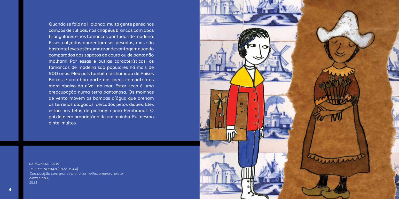
Quando se fala na Holanda, muita gente pensa nos campos de tulipas, nos chapéus brancos com abas triangulares e nos tamancos pontudos de madeira. Esses calçados aparentam ser pesados, mas são bastante leves e têm uma grande vantagem quando comparados aos sapatos de couro ou de pano: não molham! Por essas e outras características, os tamancos de madeira são populares há mais de 500 anos. Meu país também é chamado de Países Baixos e uma boa parte dos meus compatriotas mora abaixo do nível do mar. Estar seco é uma preocupação numa terra pantanosa. Os moinhos de vento movem as bombas d´água que drenam os terrenos alagados, cercados pelos diques. Eles estão nas telas de pintores como Rembrandt. O pai dele era proprietário de um moinho. Eu mesmo pintei muitos.
NA PÁGINA DE ROSTO
PIET MONDRIAN [1872-1944]Composição com grande plano vermelho, amarelo, preto, cinza e azul,1921
4

Sou Pieter Cornelis Mondriaan, ou apenas Mondrian. Prazer. Nasci em 1872, em uma pequena cidade no centro da Holanda. A vida era bem dura, e o dinheiro, pouco. Mamãe tinha uma saúde frágil, e minha irmã mais velha, Johanna Christina, com menos de 10 anos, muitas vezes ajudava em casa e cuidava dos meus três irmãos menores. Como menino mais velho, herdei o nome do meu pai e também seu talento. A arte estava no sangue. Meu tio era artista profissional e papai fazia litogravuras para a Igreja Protestante. Litogravuras são desenhos feitos em pedras que podem ser repetidos em várias impressões.
Aos 20 anos, meu pai pediu que uma família de Amsterdã me hospedasse para eu estudar na Academia de Belas-Artes da cidade. Decidi ser artista e viver disso, mas não era nada fácil. Saudade do tempo dos Mecenas, quando reis, ricos e poderosos comerciantes, bispos, banqueiros e até papas financiavam os artistas. Quem teve essa ótima ideia foi o conselheiro do Imperador Otávio Augusto, Caio Mecenas, lá no século I antes de Cristo. Grande cidadão romano esse Caio Mecenas! Na Itália, os Médicis - que eram banqueiros - e o Duque de Milão Sforza, em Veneza, patrocinaram tantos artistas... Leonardo da Vinci, Michelangelo, Rafael e Botticelli eram sortudos.
Eu, que não era o protegido de nenhum mecenas, tampouco herdeiro de uma família abastada e com 22 anos levava pouco, ou melhor, pouquíssimo dinheiro no bolso, vivia contando os trocados. Fiz todo tipo de trabalho: desenhos para salas de aula, retratos, cópias de pinturas de museus e até bactérias para ilustrar livros.
6 7

Inspirei-me no meu conterrâneo holandês, Van Gogh. Seus quadros pareceram chocantes na época. Vocês já viram pinturas do período do Renascimento? Os pintores tentavam fazer a cena parecer o mais real possível, como se o quadro fosse uma janela. Aí veio o Van Gogh com uma camada grossa de tinta, deixando claro que o que estamos vendo é pintura. Ele não tentava esconder as pinceladas - nem poderia, com tanta tinta que usava, especialmente a amarela. Muitas vezes chegava a espremer a tinta diretamente do tubo sobre a tela. O quadro estava lá, na parede do museu, e conseguíamos imaginá-lo pintando. A tela guardava a memória de seus gestos, dramáticos como um ator de teatro, quase violentos...
Na Holanda, a tradição era pintar paisagens. Como bom holandês, eu fiz o mesmo. Retratei fazendas, moinhos, igrejas, e consegui vender um pouquinho, mas o que sempre me rendeu dinheiro a vida toda foi pintar flores. Talvez vocês achem essas telas um pouco tristes, mas é só a luz dos Países Baixos. As árvores, a cor do céu, o mar têm tons mais escuros e pesados, que nós artistas chamamos de cores rebaixadas, bem diferentes das cores vivas e tropicais do Brasil.
Estava justamente trabalhando com cores carregadas e até sombrias, em uma fase noturna, quando percebi que as paisagens não precisavam representar o real, que a pintura podia expressar o que eu sentia. Essa descoberta foi um salto na minha carreira, pois comecei a pensar na arte como criação, e não imitação. Então as cores mais alegres chegaram às minhas telas.
PIET MONDRIANFazenda com salgueiros ao longo do Gein, 1902-1904
8 9

O mundo estava começando a girar mais depressa, podíamos sentir. Os trens já cruzavam a Europa neste novo século. Descobertas, como a eletricidade, chegavam à casa das pessoas. O telégrafo ainda era uma novidade e já surgia o telefone! Eu tinha 34 anos quando o brasileiro Santos Dumont voou pela primeira vez com o aeroplano 14-Bis e 35 quando a fotografia colorida foi inventada. Eram os primeiros anos de 1900. No século XX, a arte, assim como a vida, mudaria muito.
Minhas telas ganharam cores vivas, bem diferentes das cores rebaixadas que costumava usar. Ainda retratavam paisagens figurativas, mas agora as formas das árvores inclinadas sobre as águas estavam distorcidas, e os céus, ampliados em tons mais quentes. Em 1908, pintei “Paisagem Perto de Oele”, que mostra uma floresta com o sol poente no fundo. Os galhos das árvores criam um efeito parecido com o do vitral de uma igreja. As cores exuberantes agradaram o público de Amsterdã, e acabei ganhando certa fama na Holanda.
Experimentei o pontilhismo do francês Georges Seurat. Diferente de Van Gogh, que pintava rápido, Seurat apresentava uma obra meticulosamente planejada e executada. Sua tela “Domingo na Grande Jatte” custou-lhe dois anos de trabalho e mais de 60 esboços. Sua técnica era colocar inúmeros pontinhos um do lado do outro, usando apenas cores puras, sem antes misturar as tintas na paleta, como costumávamos fazer. Como esses pontos ficam muito próximos, nossos olhos juntam dois deles, e enxergamos um efeito mais vibrante, como se as cores estivessem cintilando em um dia de sol quente. Seurat estava mais preocupado com a harmonia das cores e seu efeito no observador do que com a paisagem retratada.
PIET MONDRIANCasa à luz do sol, 1909
10 11

Escolhi um tema, a árvore – e depois os emaranhados de casas de Paris –, e me pus a experimentar. Anotava minhas reflexões nos cadernos de esboço. Transformava as curvas em linhas mais retas e aos poucos ia eliminando a figura. Estava caminhando em direção à abstração.
E então me mudei para Paris, a cidade-luz para onde iam todos os artistas. Conheci Pablo Picasso e Georges Braque no momento em que os dois estavam fundando o Cubismo. A proposta do movimento era desconstruir a figura, misturando pontos de vista. Em uma pintura de um rosto cubista, por exemplo, os olhos e a boca podiam estar de frente, e o nariz, de perfil, como se fosse possível estar em duas posições ao mesmo tempo. E por quê? Os pintores não tinham mais a obrigação de retratar o real, pois a fotografia agora fazia isso. A pintura podia ser apenas pintura.
No início do Cubismo, as cores que os artistas escolhiam eram parecidas, para que não desviassem a atenção do espectador. O objetivo era que contemplássemos a obra antes que nossa razão procurasse identificar a figura. Percebi a força da linha, eliminei as cores fortes e escolhi, como Braque, os castanhos, cinzas e azuis-claros. E a partir daí iniciei minha pesquisa, que era bem diferente da deles.
PIET MONDRIAN Composição árvores I,
1912
12 13

Fui excluindo os detalhes, e as cores voltaram. Linhas e cores ganharam força e ritmo. Em 1912, me interessei pelas fachadas com andaimes de construções de Paris. Tinha 40 anos, e a geometria começava a dominar meu trabalho. Linhas, muitas linhas, até as ondas do mar se transformaram em traçados verticais e horizontais na série “Píer e Oceano”, que pintei um pouco depois.
Quando meu pai ficou doente, tive que retornar à minha terra natal. Teve início a Primeira Guerra Mundial e, por alguns anos, não pude viajar para a França. Reencontrei meu amigo Theo van Doesburg, que também estava experimentando a pintura abstrata, e juntos criamos a revista De Stijl. Tínhamos temperamentos muito diferentes, mas dizem que os opostos se atraem, não é? Eu, reservado e disciplinado; Theo, impulsivo, entusiasmado e sempre aberto a discutir.
Algumas pessoas devem me achar mal-humorado, mas sou igual ao nosso herói Guilherme – o Taciturno, Príncipe de Orange, Conde de Nassau, que lutou contra os espanhóis pela independência dos Países Baixos. Guilherme – o Taciturno era, na verdade, apenas calado ou reservado! Aliás, vocês sabiam que, apesar de a nossa bandeira tricolor ter as cores vermelha, azul e branca, os jogadores de futebol vestem a camisa laranja em homenagem ao Príncipe de Orange? Sei muita coisa a respeito das cores, como vocês podem ver.
Com todo o sofrimento que a Primeira Guerra Mundial causou, nós artistas começamos a pensar que deveríamos fazer algo para modificar a sociedade. Na revista De Stijl (que quer dizer “O Estilo” em holandês), defendíamos nossas ideias espirituais e artísticas. A arte não deveria mais reproduzir o mundo das coisas, das figuras. A beleza pura e o equilíbrio seriam alcançados apenas com as linhas retas (horizontais e verticais) e as cores azul, amarelo, vermelho, branco, preto e cinza.
Imagine se uma casa pode ser parecida com um quadro. Claro que pode! Os arquitetos deixaram de imitar os edifícios clássicos e construíram casas, um hotel e um café seguindo esse pensamento, que inclusive era econômico e funcional sem deixar de ser muito bonito. Adoro a cadeira vermelha e azul projetada por Rietveld!
Piet Zwart [1885-1977]Página da brochura Trio,
1931
Gerrit Rietveld [1888-1964]Cadeira Vermelho Azul,
1923
14

Meu ateliê tinha apenas o essencial, nada supérfluo. Minha família era muito religiosa: ordem e equilíbrio fazem parte da minha personalidade. Não guardava nem os livros que lia. Mantinha somente alguns números da revista De Stijl e uns dois ou três livros que me eram mais queridos. Os móveis eu fazia de caixote, pintados de branco. Aplicava os princípios da De Stijl em meu espaço. As paredes eram pintadas de cores primárias e conversavam com as telas dispostas nos cavaletes. As pessoas gostavam de vir ao meu ateliê e fotografá-lo, mas eu não gostava muito de sair em fotos!
Um dia, Theo abandonou as linhas horizontal/vertical e começou a usar a diagonal. Ah, isso era demais para mim! Terminei nossa amizade. Com o fim da guerra, voltei a Paris. Em meu ateliê na Rue du Départ, eu trabalhava sem parar, quase não ia aos cafés como outros artistas. Mas amo ouvir música! Eu tinha um lindo gramofone, o primeiro aparelho reprodutor de sons que utilizou discos. Para fazê-los tocar, precisava rodar a manivela do gramofone depressa, não tinha essa facilidade de ligar na tomada e muito menos baixar músicas no telefone celular. Ouvia música e praticava passos de dança no estúdio. Charleston, tango e foxtrot. Adorava as coreografias dos ritmos dos anos 1920. Não espalhem, mas em Amsterdã tive até lições na Escola de Dança.
16 17

Como meus quadros geométricos não vendiam em Paris, pintava aquarelas de flores que agradavam a clientela. Crisântemo, dálias, calêndulas, cravos- de-defunto, girassóis... as mesmas flores que já estavam nas minhas telas na Holanda.
Em 1933, não me esqueço, o partido nazista chegou ao poder na Alemanha. Hitler e seus generais passaram a determinar o que era certo e o que não podia existir no mundo. Estabeleceram que a única forma correta de pintar era representando fielmente a realidade, valorizando cada detalhe do retrato ou da cena pintada.
E tudo aquilo que o partido entendesse como errado, entre os livros e quadros produzidos, poderia ser queimado. Que medo!
Tudo que fosse um pouquinho fora do padrão, como uma pincelada mais forte, um nariz meio torto, uma árvore com cores diferentes ou uma paisagem embaralhada, era considerado “degenerado” – palavra estranha. É um termo usado para as coisas que perdem qualidade.
Não teve jeito: eu me vi um degenerado.
PIET MONDRIANComposição no3 com planos de cores,
1917
PIET MONDRIANDois copos de leite, 1918
18 19

Em 19 de julho de 1937, na cidade de Munique, na Alemanha, foi inaugurada a exposição “Arte Degenerada” com pinturas, esculturas, livros, gravuras e desenhos – um total de 650 obras. O governo nazista quis mostrar à população exemplos do que seria uma arte indesejável, prejudicial ao povo alemão. E adivinhe? Dois quadros meus estavam lá.
Acredito que, para se atingir a espiritualidade na arte, deve-se usar o mínimo possível de realidade, porque o real é o oposto do espiritual. Nós modernos prezamos pela liberdade. Como você já pode imaginar, nós e os nazistas não nos entendíamos muito bem. Por isso, em 1938, decidi sair de Paris e ir para Londres continuar criando possibilidades na pintura. Meu irmão, Carel, pôde acompanhar minhas andanças pela cidade. Enviei a ele muitos cartões-postais, alguns de pontos turísticos, como a Torre de Londres, outros com ilustrações da Branca de Neve e os Sete Anões. Eu adorava botar para tocar a música dos anões no meu ateliê, porque assistimos ao filme da Disney juntos em Paris, no início de 1938, e essa memória sempre me fazia sorrir. Queria fazer o mesmo por ele, então escrevia que a Branca de Neve veio limpar meu quarto e que esquilos desenharam nas minhas paredes usando as caudas como pincéis. No final, em vez de assinar “De: Pieter / Para: Carel”, assinava “De: Soneca / Para: Atchim”.
Foi em Londres que comecei a pintar quadros com o nome de lugares de cidades que me acolheram durante a Segunda Guerra Mundial. O primeiro se chama “Trafalgar Square”, uma praça muito movimentada que fica em um cruzamento. Na tela, a data está escrita assim: 39 – 43. Sabe por quê? Criei essa tela em 1939 e voltei a pintá-la anos depois, quando até já morava em outro país. Em 1940, o partido nazista alemão bombardeou a cidade. A janela do meu quarto foi estilhaçada por uma bomba, e fiquei assustado. Meu amigo americano Harry Holtzman sugeriu que eu fosse para os Estados Unidos. Contou-me que já haviam se mudado para lá vários outros artistas e intelectuais europeus que pensavam de forma parecida com a minha e me convenceu a ir morar na América. Mas não foram só os artistas que ficaram com medo do nazismo, muita gente decidiu fugir para os Estados Unidos, entre eles o físico Albert Einstein.
2120

Eu preferi ir de navio. De jeito nenhum pisaria em um avião! Precavido, usei durante toda a viagem um colete salva-vidas, o que não é muito elegante nem confortável, mas teria sido bastante útil no caso de algum acidente no percurso, não é?
Fiquei feliz ao chegar a uma nova terra e ser recebido com tanto entusiasmo. Como era bom ouvir jazz, ver a arquitetura e as cores vibrantes de Nova Iorque! Tudo isso me inspirou a abandonar o preto e usar só as cores primárias. Fiz uma série de quadros dedicada à cidade, entre eles um chamado “Broadway Boogie-Woogie”, de 1942, em homenagem ao estilo musical de blues com piano, tão diferente do que se ouvia na Europa.
Em 1943, só quando eu tinha 70 anos, é que foi realizada em minha primeira exposição individual, em Nova Iorque, cidade em que morei até o fim. Mas a história não termina aqui, as linhas e cores dos meus quadros ainda podem ser vistas por aí: design, decoração, artes plásticas, cinema. Tantos artistas “beberam da minha fonte”. Eu, que me vestia sempre de maneira formal, e até para pintar usava terno e gravata, nunca imaginei que fosse inspirar a moda! Na década de 60, as mulheres puderam “vestir um look Mondrian”. Um dos nomes mais importantes do mundo fashion, o estilista Yves Saint-Laurent, tinha em casa um quadro meu. Acredite se quiser, ele desenhou uma coleção de vestidos baseada nas composições geométricas que criei. E minha arte desfilou na passarela.
22 23

MONDRIANAND THE DE STIJL MOVEMENT
Story and Storyline Daniela Chindler
Illustrations Mariana Massarani
When talking about Holland, many people think of the tulip fields, the white hats with triangular tabs and the pointy wooden shoes. These shoes seem to be heavy, but they are actually pretty light and have a great advantage over leather or fabric shoes: they do not get wet! For this and other reasons, the wooden shoes have been so popular for over 500 years. My country is also called Netherlands and a great number of my compatriots actually live under the sea level. Keeping yourself dry is something to worry about while on swampy lands. Windmills move the waterbombs that drain the swamps, surrounded by dikes. The mills are present at the painters artworks. Rembrandt’s father used to own a windmill. I have painted many of them.
I am Pieter Cornelis Mondriaan, or just Mondrian. Pleased to meet you. I was born in 1872, in a small town in the center of Holland. Life was pretty hard and money was short. Mom had fragile health and my older sister Johanna Christina, under 10 years old, for many times helped doing the chores at home and cared for my three younger brothers. As the older boy, I got my father’s name and also inherited his talents. Art was in our
blood. Dad used to do lithographs to the Protestant Church and my uncle was a professional artist.
At 20, my father asked a family from Amsterdam to host me so I could study at the Fine Arts Academy in town. I’ve decided to be an artist and live of it, but it wasn’t easy at all. I miss the old times of patroning, when kings, the rich and powerful businessman, bishops, bankers and even popes financed the artists. This great idea came from the emperor Otavio Augusto’s counselor, Caio Mecenas, back in century I before Christ. Such a great roman citizen, this Caio Mecenas! In Italy, the Medicis – who were bankers – and Sforza Duke of Milan, in Venice, sponsored so many artists... Leonardo da Vinci, Michelangelo, Rafael and Botticelli were so lucky.
I, protected by no patron, nor heir of a wealthy family and only 22 years old carried short, I mean, very little money in my pocket, was always counting the change. I did all sorts of jobs: drawings for classroom, pictures, copies of museum paintings and even painted bacterias to illustrate books.
Here in Holland painting landscape is a tradition. As a good dutch man, I
did the same. I have pictured farms, mills, churches, and even sold some, but what has always given me money in my life was painting flowers.
You may find these paintings a bit sad, but that’s just the Netherland’s lights. The trees, the sky color, the sea have all got darker and heavier shades which us artists call dead - colors, very different than the lively and tropical colors of Brazil.
I was just working on heavy dark col-ors, during a shadowy period, when I realized the landscapes did’t necessar-ily have to represent the reality, that painting could express my feelings. Dis-covering that was a huge step in my ca-reer, as I started to think art as creation and not imitation. So the more cheerful colors came into my canvas.
I inspire myself in my fellow country-man, Van Gogh. His paintings seemed shocking back then. Have you ever seen old paintings from the Renais-sance period? The painters tried to recreate the scene as realistic as pos-sible, as if the painting was a window. Then comes Van Gogh with a thick layer of paint, making it clear that we are really looking at a painting. He wouldn’t try to hide the brush strokes
25

– and how could he, with that much paint he used, specially yellow. For many times he even got to squeeze the paint tube straight on to the can-vas. The artwork was there, on the museum wall, and we could imagine him painting it. The painting kept his gesture’s memories, as dramatic as a stage actor, almost violent....
I tried the pointillism of french Georg-es Seurat. Unlike Van Gogh, who was a very fast painter, Seurat presented a meticulously planned and execut-ed work. His painting “A Sunday on La Grande Jatte” costed him 2 years worth of work and over 60 drafts. His technique was to place a lot of small dots, one next to the other, using only plain color, without mixing the paints on the palette as we used to do. As these dots are so close to each oth-er, our eyes mix them and we get this vibrant effect, as if the colors were shimmering on a hot sunny day. Seur-at was more concerned about the har-mony of colors and its effects in the observer than the pictured landscape.
The world was starting to turn faster, we could feel it. Trains were already crossing over Europe in this new century. Discoveries, such as the electricity, arrived at people’s homes.
The telegraph was still a novelty when the telephone came up! I was 34 years old when brazilian Santos Dumont flew the 14-Bis airplane for the first time and 35 when color photograph was invented. It was early 1900s. In the 20th century, art, like life itself, would be a lot different.
My paintings gained vivid colors, very different than the dead-colors I was using before. Still portrayed figurative landscapes, but now inclined shapes of the trees over waters were distorted and the skies amplified in warmer shades. In 1908 I painted “Woods near Oele”. The lush colors pleased the audience in Amsterdam, and somehow I became famous in Holland.So I moved to Paris, the city of light where all the artists used to go to. I’ve met Pablo Picasso and Georges Braque at the moment they were both founding the Cubism. The movement’s purpose was to deconstruct the figure, mixing points of view. In a painting of a cubist face, for example, the eyes and the mouth could be facing front and the nose sideways, as if it was possible to be in two different positions at the same time. And why? Painters were no longer obliged to picture the real, because photography now do
that job. The painting could be just a painting.
At the beginning of Cubism, the colors chosen by the artists were similar, so they would not distract the viewer’s attention. The goal was that we contemplate the artwork before our mind tried to identify the figure. I realized the power of the lines, eliminated the bright colors and chose, as Braque, the brown, gray and light blue. And from that on I began my research, which was very different than theirs.
I chose a theme, a tree and then the tangles of houses in Paris and put myself into the experiment. I was writing my reflections in draft books. Turned the curves in straight lines and was slowly eliminating the figure. I was going towards abstraction.
I was deleting the details, and the colors were back. Lines and colors got power and rhythm. In 1912 I was interested in facades with scaffoldings constructions in Paris. I was 40 and geometry began to dominate my work. Lines, many lines, even the waves became vertical and horizontal strokes at the series Pier and Ocean that I painted short time after.
When my father got ill I had to return to my hometown. World War I began, and I couldn’t go back to France for a few years. In Holand I met up again with Theo van Doesburg, and together we created the magazine De Stijl. We had very different temperaments, but they say the opposites attract each other, isn’t it? I, reserved and disciplined; Theo, impulsive, enthusiastic and always keen for a discussion.
Some people may find me grumpy, but I’m just like our hero; William The Silent, Prince of Orange, Count of Nassau who battled against the spanish for the Netherlands’s independance. William The Silent was, in fact, just quiet or reserved! By the way, did you know that, despite our flag being in three colors red, white and blue, our national football team wears the orange uniform in honor of the Prince of Orange? I know a lot regarding colors, as you can see.With all the suffering caused by the World War I, us artists began to think that we should do something to change society. In De Stijl magazine (that means “the style” in dutch) we defended our ideas, spiritual and artistic. Art must not reproduce the world of things and figures anymore.
26 27
Pure beauty and balance would be reached only by straight lines (horizontal and vertical) and the colors blue, yellow, red, white, black and gray.
Imagine if a house can look like a painting. Of course it can! The architects no longer imitate the classical buildings and built houses, a hotel and a café following this thought that was even economic and functional while being very beautiful. I love Rietveld’s Red and Blue Chair.
One day Theo abandoned the horizontal/vertical lines and began to use diagonal. Ah, that was too much for me! I ended our friendship.
By the end of the war I returned to Paris. In my atelier at Rue du Départ I was working non stop, would hardly go to the cafes like the other artists did. But I love to listen to music! I used to have a gorgeous gramophone. The first ever sound playing equipment to use discs, to play it I had to turn the crank quickly, had no such facility as plugging it in the powerpoint let alone downloading music on mobile phones. I listened to music and practice dance
moves in the studio. Charleston, tango and Foxtrot. I used to love the choreographies of the rhythms in the 1920s. Don’t share it, but in Holland
I even attended classes at the Amsterdam Dance School. In my atelier I only keep the essencial, nothing superfluous. My family was very religious: order and balance are parts of my personality. Not even the books I read I kept. Only a few issues of De Stijl magazine and a couple of my favourite books is what I kept. The furniture I made of crates, painting them white. Applied the principles of De Stijl in my own space. The walls were painted in primary colors and talked to the paintings lying at the easel. People loved to come to my atelier and photograph it, but I never liked to be on the pictures!
In Paris my geometrical paintings weren’t selling, that’s why I painted watercolors of flowers that pleased the clients. Chrysanthemums, dahlias, calendules, marigolds, sunflowers... the same flowers that were in my works back in Holland.
In 1933, I cannot forget, the Nazi party got into power in Germany. Hitler and his generals started to determine
what was correct and what should not exist in the world. They established that the only correct way of painting was representing reality accurately, valuing every detail of the portray or scenery painted. And everything that the party understood as wrong among the books and paintings could be burned. So scary!
Everything that was a little bit different, as a stronger brushstroke, a crooked nose, a tree with different colors or a mixed up landscape, was considered “degenerated” – strange word. It’s a term used to things that lost its quality.There was no other way: I was seeing myself as a degenerated.
On the 19th of July of1937, in the city of Munich, Germany, the exhibition “Degenerated Art” was open with paintings, sculptures, books, prints and drawings – totalizing 650 pieces. The Nazi government wanted to show the population examples of what would be an undesirable art, harmful to the German people. And guess what? Two of my paintings were there.
I believe that to accomplish spirituality, we should use the less reality possible, because real is the
opposite of spiritual. We modernists cherish freedom. As you can imagine, we and the Nazis did´n´t get along too well. That´s why in 1938 I decided to leave Paris and move to London, so that I could keep creating new possibilities for painting.
My brother, Carel, kept track of my wanderings around town. I’ve sent him many postcards, some from the city’s sightseeings, such as the London Tower, but posted others Snow White and the Seven Dwarfs illustrations. I loved to put on the music of the dwarves to play in my studio, because we watched the Disney movie together in Paris in early 1938 and that memory always made me smile. I wanted to do the same for him, so I wrote that Snow White came to clean my room and that the squirrels draw my walls using their tales as brushes. At the end, instead of signing “From Pieter/ To: Carel” I signed “From: Sleepy/ To: Sneezy”.
It was in London that I started naming paintings after places of the city that welcomed me during World War II. The first one was called “Trafalgar Square”, a busy square located at a crossing. On the painting, the date is written 39-43. Do you know why? I created this painting in 1939 and
28 29
returned to it many years later, when I was already living in another country.In 1940, the Nazi party bombed the city. A window from my room was shattered by an explosion and I was scared. My American friend Harry Holtzman gave me the idea of going to the United States. He told me that many other European artists and intellectuals had moved there, even said that many of the artists that lived there thought in a similar way that I did and so he convinced me to live in America. But not only the artists were afraid of the Nazism, many people decided to escape and run to the United States, amongst them was the physicist Albert Einstein.
I preferred to go on a ship. There was no way I would step on an airplane! Cautious, I wore the lifejacket during the whole trip, which was not very elegant or comfortable, but would have been very useful in case of an accident, right?
I was glad to arrive in a new land and be welcomed with such enthusiasm. How good it was to listen to jazz, see the architecture and the vibrant colors of New York! All this have inspired me to abandon the black and use only the primary colors. I did a
series of works dedicated to the city, among them one, called “Broadway Boogie-Woogie”, from 1942, in honor to the musical style blues with a piano, so different from what people were listening to in Europe.
At 1943, only when I was 70 years old, that happened in New York my first individual exhibition. It was in this city that I lived until the end. But the story doesn’t end here, the lines and colors of my paintings can still be seen around: design, decoration, visual arts, cinema. Many artists were inspired by me. I, who always wore formal clothing, even for painting used to wear suit and tie, never imagined that my paintings would be an inspiration to fashion! In the sixties, woman could “wear a Mondrian look”. One of the most important names of the fashion world, the stylist Yves Saint-Laurent had at his home a painting of mine. Believe it or not, he draw a dress collection based on the geometric compositions that I created. And my art was modeling on the catwalk.
30 31
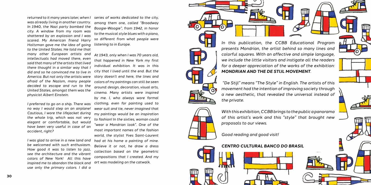
In this publication, the CCBB Educational Program presents Mondrian, the artist behind so many lines and colorful squares. With an affective and simple language, we include the little visitors and instigate all the readers for a deeper appreciation of the works of the exhibition: MONDRIAN AND THE DE STIJL MOVEMENT. “De Stijl” means “The Style” in English. The artists of this movement had the intention of improving society through a new aesthetic, that revealed the universal instead of the private. With this exhibition, CCBB brings to the public a panorama of this artist’s work and this “style” that brought new proposals to our views.
Good reading and good visit!
CENTRO CULTURAL BANCO DO BRASIL

Educativo Produção Apoio Realização
PatrocínioBanco do Brasil
Realização Centro Cultural Banco do Brasil
Projeto EducativoSapoti Projetos Culturais
Coordenação GeralDaniela Chindler
Coordenação Geral de ProduçãoFernanda SaulFlavia RochaGabriela da Fonseca
Coordenação Geral AdministrativaFernanda Galvão
PROGRAMA CCBB EDUCATIVO AÇÕES MEDIADAS
Coordenação PedagógicaKaren Montija
Coordenação de Ações EducativasLuciana Chen
Coordenação de ProduçãoNatália Salles
Estagiárias de ProduçãoFabíola Ortiz
Educador SapotiBruna Pessoa
Educadores GraviolaAnne MagalhãesBruno RamosIzabela MarianoRobson Rosa
EstagiáriosAlexandre PereiraAlexandre Taiki Beatriz BarrosBruna Emiliano Bruno LourençoJéssica PolicastriLetícia EpiphanioLucas PucciniLucas CominatoMaíra Sciuto
CADERNO DE MEDIAÇÃO
RedaçãoDaniela Chindler
PesquisaLuciana Chen
RoteiroDaniela Chindler
ColaboraçãoFernanda SaulGustavo GaviãoJessica PolicastriKaren Montija
IlustraçãoMariana Massarani
RevisãoMarcela Lima
Tradução para inglêsThais Saul
Projeto GráficoREC Design
EXPOSIÇÃOMondrian e o Movimento De StijlTemporada São Paulo25 de janeiro a 04 de abril de 2016
Concepção e Coordenação Geral Gemeentemuseum Den Haag, HolandaFrans PeterseArt UnlimitedPieter Tjabbes / Tânia Mills CuradoriaBenno TempelHans JanssenPieter Tjabbes Agradecimentos Gemeente Museum Den HaagHet Nieuwe Instituut, RotterdamCentraal Museum, UtrechtRijksdienst Kunsthistorische Documentatie, Den HaagConsulado Geral do Reino dos Países Baixos em São Paulo
Todas as obras que aparecem nesse livro fazem parte daColeção Gemeentemuseum Den Haag, Holanda.
CCBB SÃO PAULORua Álvares Penteado, 112Centro, São Paulo - SP(Próximo às estações do metrô São Bento e Sé)
Informações(11) 3113-3651bb.com.br/cultura
Agendamento de grupos(11) 3113-3649
SAC 0800 729 0722Ouvidoria BB 0800 729 5678Deficiente auditivo ou de fala 0800 729 0088
Alvará de Funcionamento nº 2015/12479-00
Auto de Vistoria do Corpo de Bombeiros nº 194922
twitter.com/ccbb_sp
facebook.com/ccbbsp
pinterest.com/ccbbsp