Typeology issue 1
44
-
Upload
rositsa-gorolova -
Category
Documents
-
view
228 -
download
2
description
font magazine
Transcript of Typeology issue 1
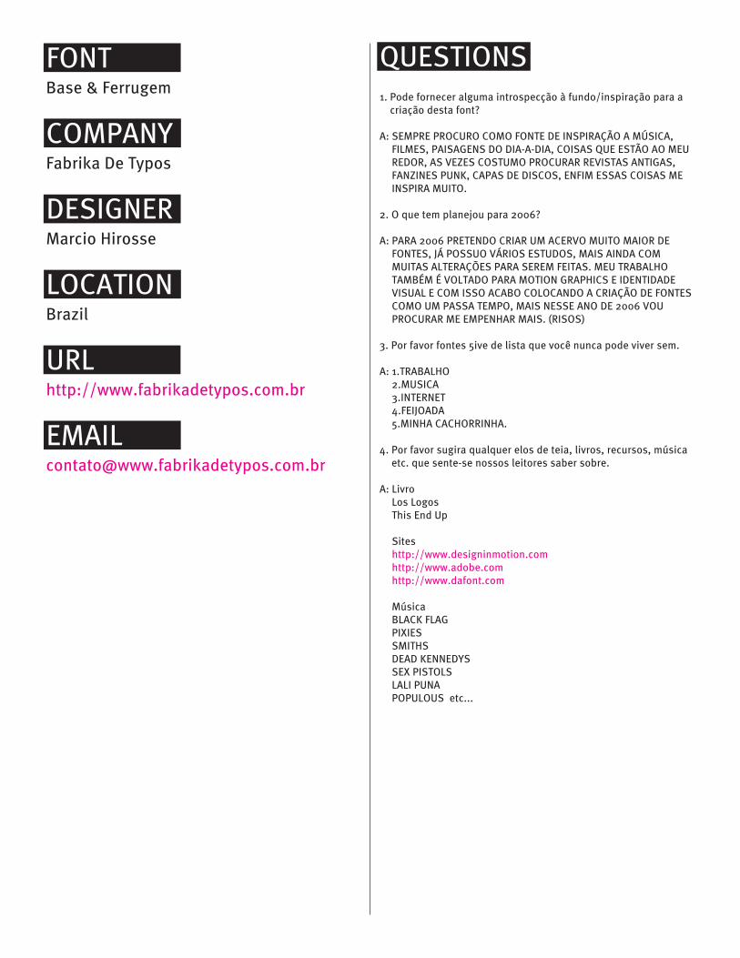
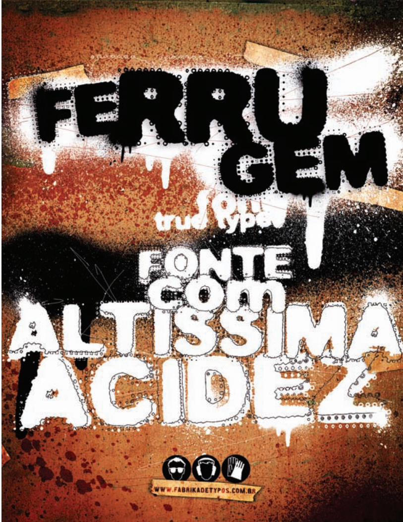
FONTBase & Ferrugem
COMPANYFabrika De Typos
DESIGNERMarcio Hirosse
LOCATIONBrazil
URLhttp://www.fabrikadetypos.com.br
QUESTIONS1. Pode fornecer alguma introspecção à fundo/inspiração para a
criação desta font?
A: SEMPRE PROCURO COMO FONTE DE INSPIRAÇÃO A MÚSICA,FILMES, PAISAGENS DO DIA-A-DIA, COISAS QUE ESTÃO AO MEUREDOR, AS VEZES COSTUMO PROCURAR REVISTAS ANTIGAS,FANZINES PUNK, CAPAS DE DISCOS, ENFIM ESSAS COISAS MEINSPIRA MUITO.
2. O que tem planejou para 2006?
A: PARA 2006 PRETENDO CRIAR UM ACERVO MUITO MAIOR DEFONTES, JÁ POSSUO VÁRIOS ESTUDOS, MAIS AINDA COMMUITAS ALTERAÇÕES PARA SEREM FEITAS. MEU TRABALHOTAMBÉM É VOLTADO PARA MOTION GRAPHICS E IDENTIDADEVISUAL E COM ISSO ACABO COLOCANDO A CRIAÇÃO DE FONTESCOMO UM PASSA TEMPO, MAIS NESSE ANO DE 2006 VOUPROCURAR ME EMPENHAR MAIS. (RISOS)
3. Por favor fontes 5ive de lista que você nunca pode viver sem.
A: 1.TRABALHO2.MUSICA3.INTERNET4.FEIJOADA5.MINHA CACHORRINHA.
4. Por favor sugira qualquer elos de teia, livros, recursos, músicaetc. que sente-se nossos leitores saber sobre.
A: LivroLos LogosThis End Up
Siteshttp://www.designinmotion.comhttp://www.adobe.comhttp://www.dafont.com
MúsicaBLACK FLAGPIXIESSMITHSDEAD KENNEDYSSEX PISTOLSLALI PUNAPOPULOUS etc...

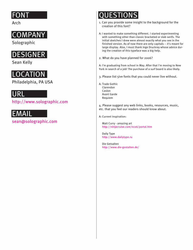
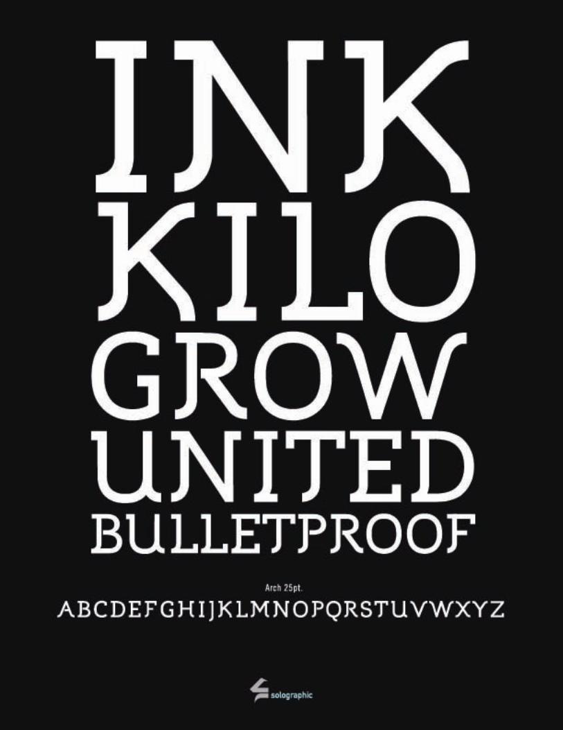
FONTArch
COMPANYSolographic
DESIGNERSean Kelly
LOCATIONPhiladelphia, PA USA
URLhttp://www.solographic.com
QUESTIONS1. Can you provide some insight to the background for the
creation of this font?
A: I wanted to make something different. I started experimentingwith something other than classic bracketed or slab serifs. Theinitial sketches I drew were almost exactly what you see in thefinished version. As of now there are only capitals -- it's meant forlarge display. Also, I must thank Inge Druckrey whose advice dur-ing the creation of this typeface was a big help.
2. What do you have planned for 2006?
A: I'm graduating from school in May. After that I'm moving to NewYork in search of a job! The purchase of a surf board is also likely.
3. Please list 5ive fonts that you could never live without.
A: Trade GothicClarendonCaslonAvant GardeRequiem
4. Please suggest any web links, books, resources, music,etc. that you feel our readers should know about.
A: Current inspiration:
Matt Curry - amazing arthttp://ninjacruise.com/nc06/portal.htm
Daily Typehttp://www.dailytype.ru
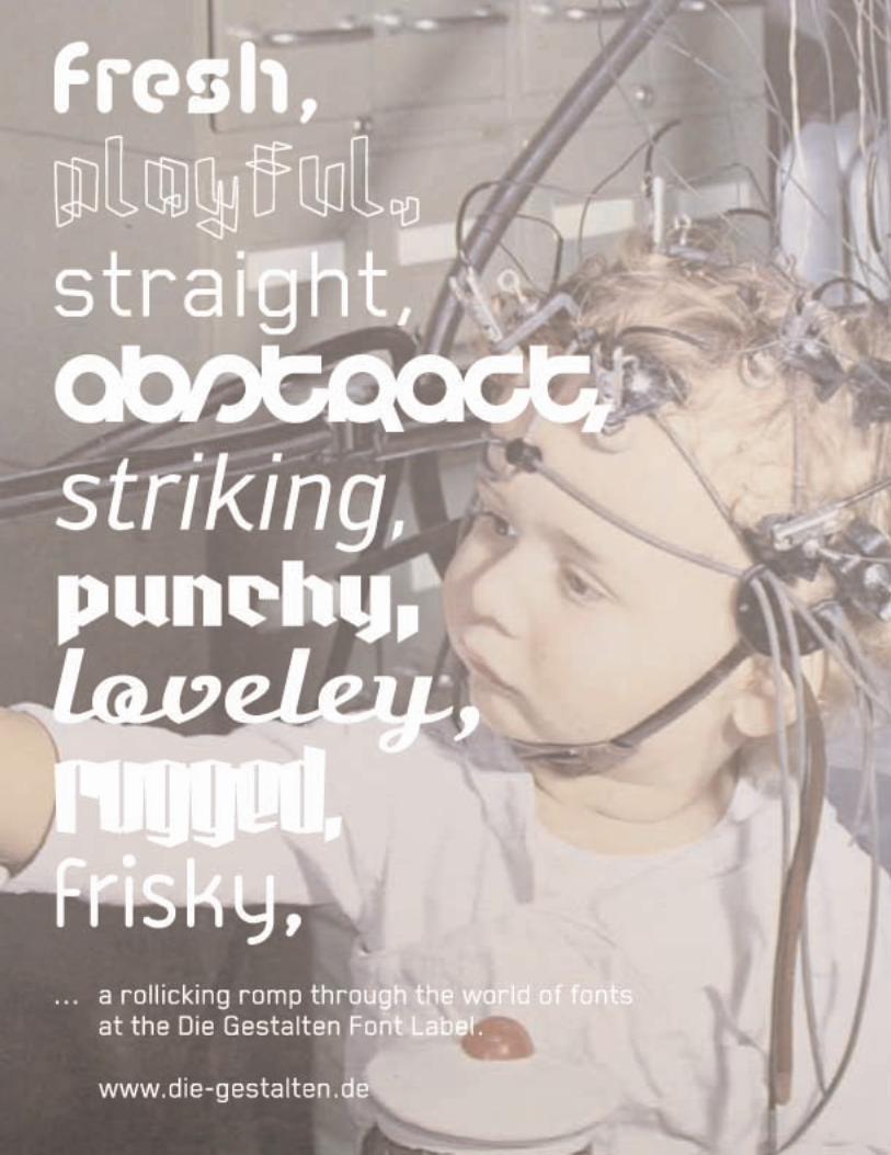
Die Getsaltenhttp://www.die-gestalten.de/


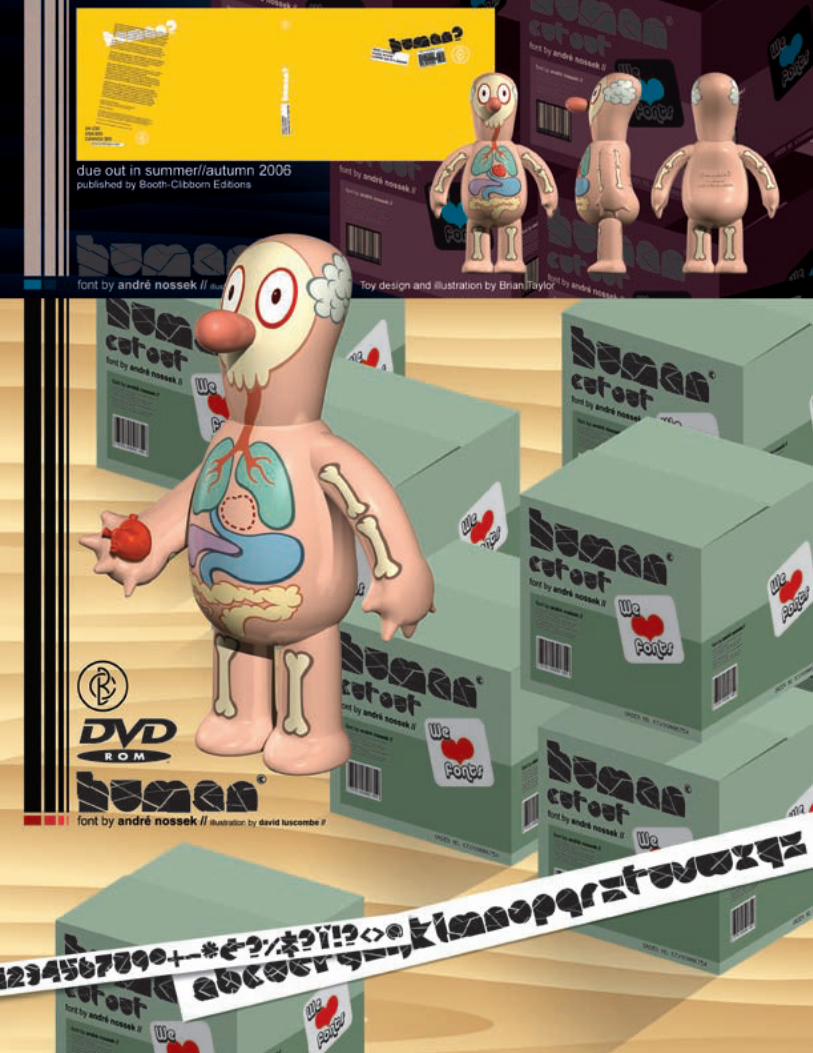
FONTHuman?
COMPANYfontmonster
DESIGNERAndre Nossek
LOCATIONEurpoe
URLhttp://www.fontmonster.org
QUESTIONS1. Can you provide some insight to the background for the
creation of this font?
A: The Human? font was a total surprise to us regarding the project.Andre Nossek sent it to us as part of his submission fromViagrafik. He sent it along with a great video and amazing printpiece, oh, as well as a playing card. A very strong submission andreally lifted the spirit of the project.
2. What do you have planned for 2006?
A: We are looking at a huge online project for 2006. It's all topsecret but promises to be exciting should it fail or succeed. I'malso working on a animated tv show with a life long pal. It's stillin the planning stage but he is writing and I'm busy developingthedesigns and scenes as well as learning as much as I can about3D, animation and compositing. I have a little background in allof those so It's all shaping up. That should be ready for approach-ing TV companies in 2007 if we get our heads down.
3. Please list 5ive fonts that you could never live without.
A: I used to always use helvetica but now I just use whatever isaround and try to switch from project to project. If it's work relat-ed as in my full time job I just use whatever they tell me to use.It's like that there.
4. Please suggest any web links, books, resources, music,etc. that you feel our readers should know about.
A: I think a shameless self plug is appropriate here, Freewave byBooth-Clibborn has over 40 fonts, sounds, code, illustrations andphotos as well as a bunch of other stuff so thats a great resource.I also love the Designer Shock book DSOS1, if you can get a holdof that it's definitely worth having. As for information I thinkhttp://digg.com and www.boingboing.net are a must have in yourfaves.
FONTDuerer & Halcyon
COMPANYl´Abécédarienne
DESIGNERAmy Conger
LOCATIONUSA
URLhttp://www.abecedarienne.com/
QUESTIONS1. Can you provide some insight to the background for the
creation of this font?
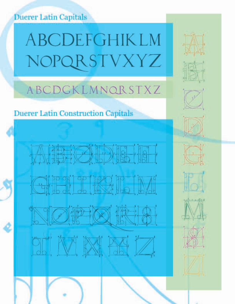
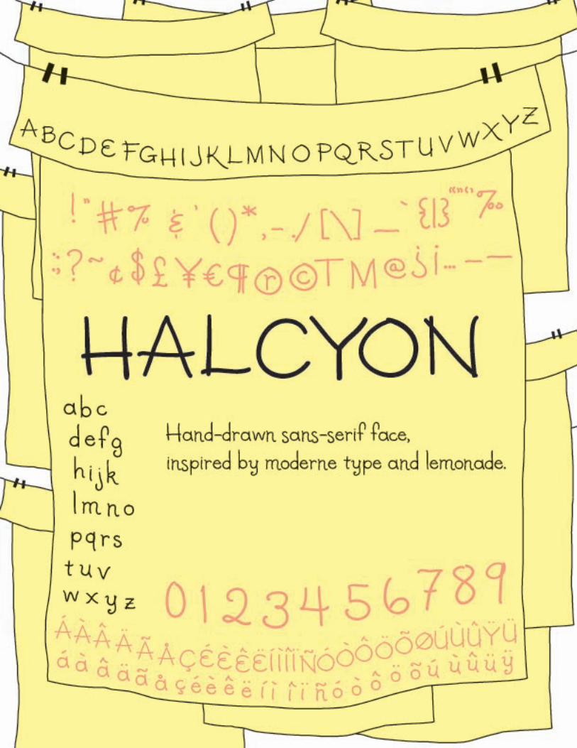
A: Halycon was designed by accident while I was trying outFontLab's drawing tools. I drew the capitals (somewhat inspiredby Moderne type) quickly in one go and then went back somemonths later and filled in the lower case. To finish it, I workedwith Mark Clarin, a young designer who helped me slog throughall the little details. I owe a debt of gratitude to the critique teamat TypeCon 2004 (Matthew Carter, John Downer, and AkiraKobayashi) who gave me great suggestions for refining the font.It turned out to look more whimsical than it would have had Iplanned it, and I love it
With Duerer Capitals, it was a matter of my seeing the drawingsand saying, "Ooh, I want to make that into a font!" AlbrechtDuerer and so many of his contemporaries did their best toquantify what makes a Roman capital letter pleasing to the eye.While I am not sure that can ever be expressed entirely mathe-matically, they certainly made some beautiful drawings while try-ing to do so. They are, to me, evocative of the architecture of thetime, of flying buttresses and stained glass windows..
2. What do you have planned for 2006?
A: I have a font in the works that is inspired by "naïve" letteringfrom a lost cat flyer, everything else is is still in the "maybe" col-umn. I may also follow up the Duerer fonts with fonts based on
the constructions of Pacioli or de Yciar. I am also considering anOpenType version of Respess which would automatically alter-nate between the four weights. This may be the year I get aroundto making the flowing script that is always hanging around in mybrain, but no promises! I like to work slowly, for the love of it.
I plan to offer lettering and font design classes at City College ofSan Francisco as I did last Fall. Also, in the summer I would liketo take on a couple of students interested in learning font-mak-ing who want to intern.
3. Please list 5ive fonts that you could never live without.
A: 1. Georgia2. Syntax3. Nars4. Unibody85. the rest are negotiable
4. Please suggest any web links, books, resources, music,etc. that you feel our readers should know about.
A: Typophile.comhttp://www.typophile.com
How to draw thorn and ethhttp://briem.ismennt.is/2/2.11/
Gentiumhttp://scripts.sil.org/cms/scripts/page.php?site_id=nrsi&item_id=Gentium
The Alphabet Synthesis Machinehttp://alphabet.tmema.org/
Calligraphy: From Calligraphy to Abstract Painting by ClaudeMediavillahttp://www.amazon.com/gp/product/9080332518/qid=1138341905/sr=1-6/ref=sr_1_6/102-5016008-1248953?s=books&v=glance&n=283155
The Story of Writing by Andrew Robinsonhttp://www.amazon.com/gp/product/0500281564/qid=1138341986/sr=2-1/ref=pd_bbs_b_2_1/102-5016008-1248953?s=books&v=glance&n=283155
Letter Perfect : The Marvelous History of Our Alphabet From A toZ by David Sackshttp://www.amazon.com/exec/obidos/tg/detail/-/0767911733/qid=1138342040/sr=2-1/ref=pd_bbs_b_2_1/102-5016008-1248953?v=glance&s=books
HP Lovecraft Historical Society fonts collectionhttp://www.cthulhulives.org/toybox/PROPDOCS/PropFonts.html
Manfred Klein's collection at Typoasishttp://www.moorstation.org/typoasis/designers/klein/index.htm
My instructional page at City College of San Franciscohttp://fog.ccsf.cc.ca.us/~aconger/in case anyone's interested in classes


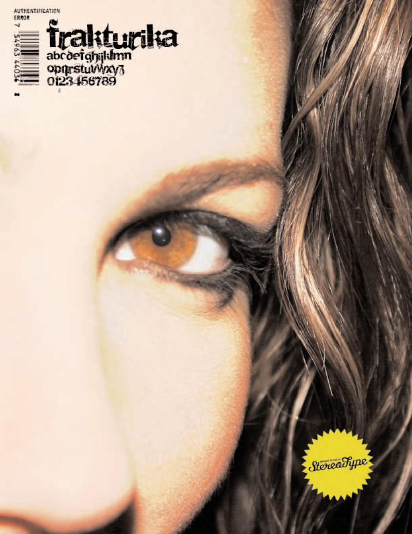
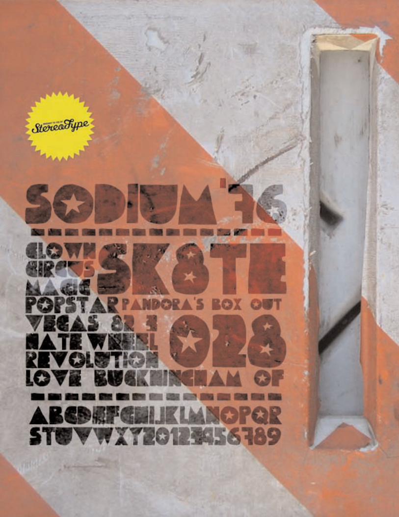
FONTFrakturika & Sodium'76
COMPANYStereo-Type
DESIGNERClément Nicolle
LOCATIONFrance
URLhttp://www.stereo-type.net
QUESTIONS1. Can you provide some insight to the background for the
creation of this font?
A: Frakturika is a Fette Fraktur - Helvetica mixed font. Basically,though I couldn't get an idea of the result, the goal was to mixtwo very trendy fonts. I was surprised to see that it resulted likean error, a typographic failure, a bastard font. So I decided to addhere and there some graphic signs reffering to spam mail (Re :your letter ; Re : your software...). Many people asked me to sendanother font because it was corrupted ! The goal was reached.But I preferred to included a "not corrupted" version of the font.
Sodium'76 was first designed to illustrate a book about history ofcircus. But now, I think that it has a trendy style and I really likehow it works for big titles. I like this handcut effect too.
2. What do you have planned for 2006?
A: My new website (www.stereo-type.net) entirely dedicated to typeexperiment will be online very soon. I'm planning to set up anonline payment system for a few font but, it will also contain freefonts of course.
But above all, I've planned for 2006 to keep much more time formy family and friends.
3. Please list 5ive fonts that you could never live without.
A: Helvetica (of course !), Din, FF Info, Parisine Plus, Mest, buthonestly, I couldn't live with only 5 fonts.
4. Please suggest any web links, books, resources, music,etc. that you feel our readers should know about.
A: Tons of useful links here : http://www.newstoday.com ; there :http://www.surfstation.lu and there: http://youworkforthem.comDon't miss "No Logo" by Naomi Klein, but I'm sure everybodyalready read it!
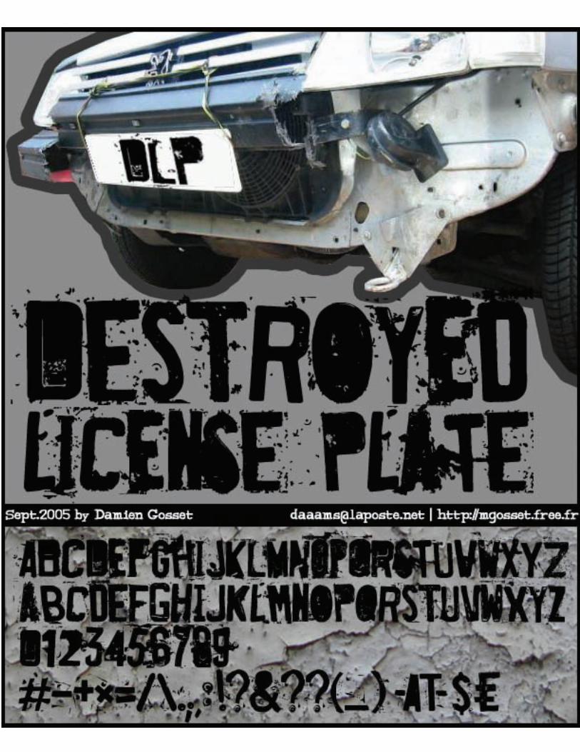
FONTDestroyed License Plate
DESIGNERDamien Gosset
LOCATIONFrance
URLhttp://mgosset.free.fr/cv/
QUESTIONS1. Can you provide some insight to the background for the
creation of this font?
A: "Destroyed License Plate" has been created from pictures I tookwith my camera, of old broken license plates i found in thestreets of the City of Lights (Paris). I wanted to create a font thathave a true trash feeling, so i thought the best thing to do was tofind real trashed letters. Then i had to create some letters andspecial caracters you cannot find on licence plates...
2. What do you have planned for 2006?
A: Nothing special... find a new job, and find some time tocreatenew fonts. Having a nice girlfriend (hi Lilly !) takes a lot of time...
3. Please list 5ive fonts that you could never live without.
A: Verdana (as i'm a webdesigner), Yanone "Kaffeesatz",Linotype"Banco", Linotype "KursivSchrift", Umbrella "Ministry Script".Can I add Underware "Bello Pro" ?
4. Please suggest any web links, books, resources, music,etc. that you feel our readers should know about.
A: weblinks :http://www.dafont.com (the best free fonts)http://cgm.cs.mcgill.ca/~luc (Luc Devroye's font listing,really complete!)
books :Coin Locker Babies (Murakami Ryu, JP)Jiu Guo (Mo Yan, CN)
music :Carreer Suicide (CA, 80's hardcore)DFA (CA, thrashcore)Municipal Waste (USA, thrashcore)Dead Stop (BE, hardcore)Svinkels (FR, hip-hop)Mano Solo (FR, singer)

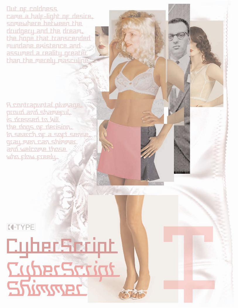
FONTCyberScript
COMPANYK-Type
DESIGNERKeith Bates
LOCATIONUK
URLhttp://www.k-type.com/
QUESTIONS1. Can you provide some insight to the background for the
creation of this font?
A: CyberScript was inspired by some lettering from Bond andCoyne Associates in Charlotte Rivers' excellent book about cus-tom fonts, Type Specific (RotoVision). The lettering had beenmade out of metallic security tape. I took the basic shapes oftheir lower case, made a few changes and added a whole newupper case and a full range of symbols and accents. Even on K-Type freebies we always like to provide a full compliment ofLatin keyboard glyphs - none of those missing sterling or eurosymbols, etc.
CyberScript Shimmer is the wobbly 'n' wavy freebie. It justseemed like a good idea at the time, a bit of fun that proved per-fect for Typeology. The straight version will probably prove moreuseful for designers, that's going to appear soon as a pay fonton the K-Type website.
2. What do you have planned for 2006?
A: I've got a couple of other fonts also close to being ready to putup.
Rick Griffin and Rick Griffin Contour are based on Rick's beauti-ful poster lettering from the San Francisco Sixties. If you've seenthe font 'Hendrix' by David Nalle you've got the idea. True to K-Type form, Rick Griffin and Rick Griffin Contour are full fonts, all
the usual Latin keyboard characters and an all-new lower casethat Rick himself would be proud of (hopefully).http://www.k-type.com/kernel/
I must write a piece about Typeology for the Kernel on the K-Typewebsite!
FlatPack is a modular font made from the square fits-togetherflat pack pieces I received from Gavin Peacock, also known asthe mailartist 'The Man from Icon'. I couldn't think of what tomake from his cardboard pieces so I made a font.
I'd like this year to give up teaching Art in a high school. My part-ner Leanda has just launched her graphic design business andI'd like to be her slave, tea-boy, gopher and student of CSS.She's a brilliant designer and takes marvellous photographs too.We live in hope and are working hard to make it happen.http://www.leandaryan.com/ We'd both like to go to New Yorkagain if we ever make any money.
3. Please list 5ive fonts that you could never live without.
A: First off the starting block would be Helvetica. It's not perfect butit is fab. I know it's unfashionable to say so, but I quite like Arialtoo, infectious solution to the fussy G of Akzidenz Grotesk.
In fact, I don't need five fonts, if I've only got five I'll just stickwith Helvetica thanks. I suppose I should choose a serif, Georgialooks nice on the web and Minion is great for print, and a script,Zapfino is a beauty. No, it's no use, I'll stick with Helvetica or yougive me the five hundred I need to stay sane!
4. Please suggest any web links, books, resources, music,etc. that you feel our readers should know about.
A: I found Chank Diesel's 'How to make your own fonts' prettyinspirational when I started - http://www.chank.com/howto/
The Swedish foundry Fountain is well worth a peek -http://www.fountain.nu/catalogue/ericsans.asp
I really enjoyed '3 Found Fonts' by Jake Tilson+ Lewis Blackwell's '20th Century Type'
John Lennon's Dirty Mac with a great guitar solo from EricClapton -http://blogfiles.wfmu.org/KF/0510/dirty_mac_-_yer_blues.mpg
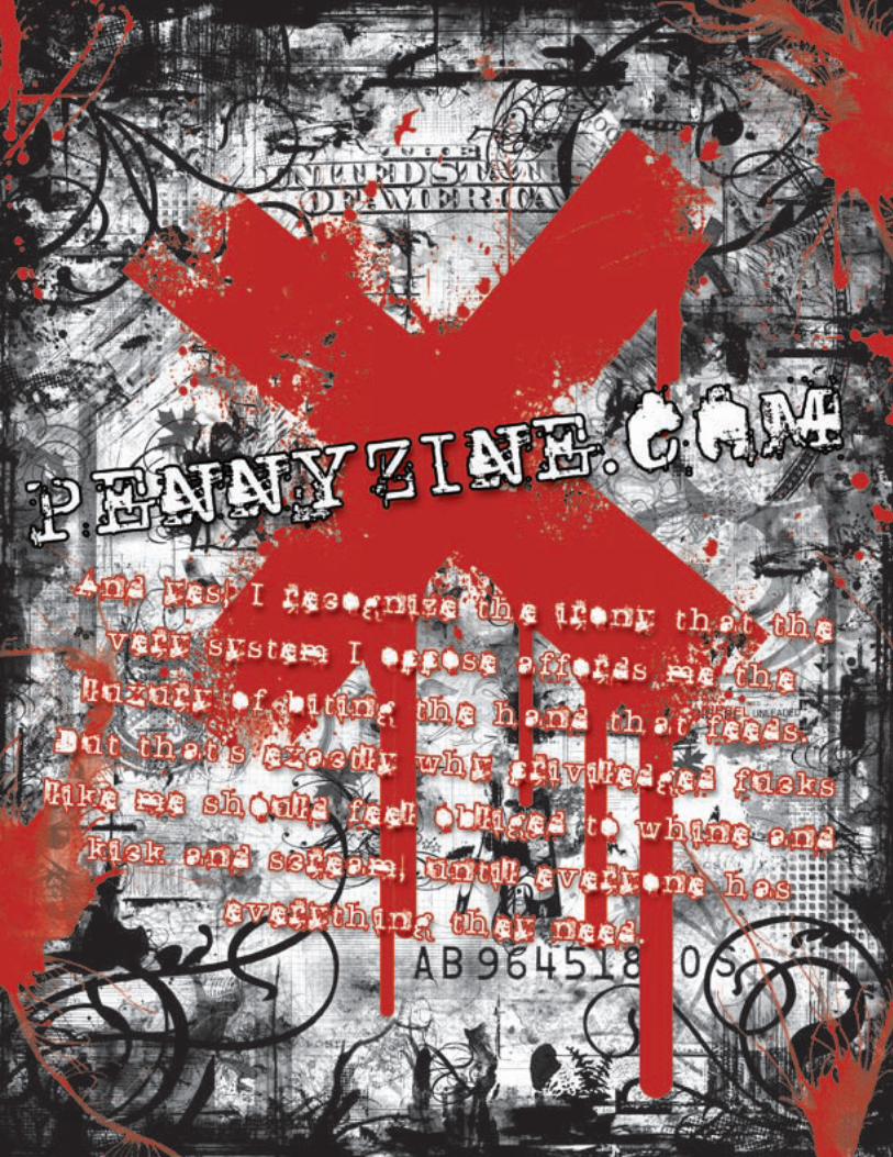
FONTDon Giovanni Makin Enemies
COMPANYPennyzine
DESIGNERJason Ramirez
LOCATIONUSA
URLhttp://www.pennyzine.com/
QUESTIONS1. Can you provide some insight to the background for the
creation of this font?
A: Basically, I like to make stuff that looks like it got pulled out of agutter and then punched in the face. Coming from a punk rockbackground, I like to use type that is distressed and unconven-tional, and I tend to cater to punk bands who like my fonts forthier flyers, etc.
2. What do you have planned for 2006?
A: I plan on drinking a lot of beer and coffee, and making a fewfonts in between.
3. Please list 5ive fonts that you could never live without.
A: Budapest, Base 02, Blue Baby, Boycott, Cartaz, Dirty Ego,Downcome, Arial
4. Please suggest any web links, books, resources, music,etc. that you feel our readers should know about.
A: punkvoter.com, propagandhi, alkaline trio, getup kids, atmos-phere, the dan band, sarahasaturday.com, stimtv.com, realulti-matepower.com, designiskinky.com, punkplanet.com, "the bestdemocracy money can buy" - Gregg Palast, "Lies my Techer ToldMe" - James Loewen, "State by State with The State" - TheState..... I could go on, but I won't,...haha.
FONTCinquenta mil meticais & dinarjev republika
COMPANYpolenimschaufenster
DESIGNERHannes Siengalewicz
LOCATIONAustria
URLwww.jestyle.net/polenimschaufenster/
QUESTIONS1. Can you provide some insight to the background for the
creation of this font?
A: Both fonts are inspired by characters from banknotes thatfriends brought me from various trips around the globe."Cinquenta mil meticais" is based on a banknote from mosam-bique, "dinarjev republika" on letters on banknotes from a for-mer yougoslavian country. Dinarjev features some kyrillic let-ters and with its heavy outlines the crumpled and slightly dis-tressed look from the old banknotes it gets this special "ost-block" kind of feel.
There are some more old banknotes that lost its value that Icollected over time and im planning to complete them to a big-ger collection or font family someday.
2. What do you have planned for 2006?
A: Im currently working on the launch of polenimschaufenster.comwhich is gonna be part portfoliosite, featuring my recent worksfor various austrian bands and record labels and part fontfoundry. There are gonna be some commercial fonts for the firsttime, but there will still be the old free fonts and also some newones, available for free. Also expect some reworked and updatedversions of fonts that I already published.
For my diploma that I just finished, I experimented with openTypeprogramming and created a font family based on inscriptions ongravestones, called EpigraphFonts, which will also be availablefor purchase.
3. Please list 5ive fonts that you could never live without.
A: This one is tough. I recently fell in love with Chaparral, I use itover and over again. Other favourites? AvantGarde, Dolly, Absaraand Akzidenz Grotesk.
4. Please suggest any web links, books, resources, music,etc. that you feel our readers should know about.
A: Everybody already knows all those fontresource-sites around soI'll go with music. bands with beards rock! and you should lovethem too! aereogramme, he is legend, bear vs. shark, JR Ewing(ok, its a moustache, not a full one), dredg and facing new york.Go out an buy their cds or LPs, now!
And for people who know german: go and get the book "Fleischist mein Gemüse" by Heinz Strunk. This is one of the few booksthat makes me laugh out loud and spray tears out of my eyes. Getit now!

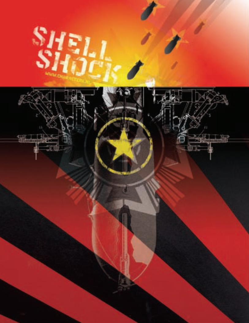
FONTShell Shock
COMPANYCharacters
DESIGNER®ené Verkaart
LOCATIONNetherlands
URLhttp://www.characters.nl/
QUESTIONS1. What do you have planned for 2006?
A: I have a lot of exiting plan for this year, but my first priority in2006 is to *finally* get my font family Nordic Narrow ready. PeterBruhn from Fountain has been waiting much too long for it (sorryPeter). A lot of people are asking me where they can buy it so Ireally need to finish it. I've been working on it on and off for thelast two years. If I wait longer the font will be outdated. ;-)
Last year I got into contact with Grant Hutchinson at Veer. Theyliked my fonts and we agreed to release 6 of my fonts in theirUmbrella collection. We will spread the releases out over theyear. I loved Veer from the beginning so I'm exited about ourcooporation.
I do a lot of custom typefaces for friends and clients, so I have afew interesting releases coming up. Three new font releases areplanned for february 2006.
Last but not least, my website will be upgraded. I feel more andmore the need to give background information about my fontsand share knowledge with the typograpical community. This willbe reflected in my website, because that's my channel to talk tothe people out there.
2. Please list 5ive fonts that you could never live without.
A: It's hard to give you five names, because I like to always changethe fonts around me. I guess my most favourite fonts are:Helvetica Neue, Scala, Meta, Insider and Verdana.
. Please suggest any web links, books, resources, music, etc.that you feel our readers should know about.
A: WebsitesAn absolute must!!!: www.typophile.comhttp://www.lounge72.com/http://ventilate.ca/http://www.newstoday.com/http://www.designaside.comhttp://www.core77.com/
Blogshttp://www.fontblog.de/http://www.technorati.com/tag/typografiehttp://www.underconsideration.com/speakup/
RSShttp://www.justincone.com/wordpress/wp-rss2.phphttp://www.lounge72.com/root/xml.phphttp://houseind.com/showandtell/?rss=1http://blog.veer.com/index.xmlhttp://www.fontblog.de/rss.xmlhttp://www.characters.nl/rss/rss.xml
MusicAnything from Prince, Bjork, Global Communication, GrandmasterFlash, Whodini, Boards of Canada, 4Hero, The Jacksons andCashmere.
BooksLearn FontLab fast, by Leslie Cabarg
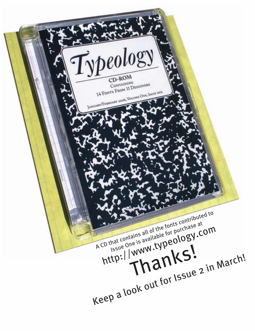
A CD that contains all of the fonts contributed to
Issue One is available for purchase at
http://www.typeology.com
Thanks!
Keep a look out for Issue 2 in March!